Inside Our Website Redesign: 7 Steps to Effective Planning
After 6 months of non-stop work, dozens of design reviews, and roughly 875 cups of coffee (trust me, I counted), we finally launched our new website!
Looking back at the past 3 years, Oktopost has changed dramatically –incorporating new faces, new solutions, new products, new partners, and even a new Okty (our mascot). To welcome these changes and showcase them to the world, we decided it was time for a website redesign.
Whether you’re working with a creative agency or an in-house web designer, I want to take you behind-the-scenes to reveal the steps we’ve taken to approach this project:
Step 1: Review Existing Website
A website redesign is more than just a cosmetic makeover. It’s about identifying current gaps and generating more visitors, leads, and revenue.
So before you start building that Pinterest-wall of inspiration, ask yourself the following questions: How effective are your existing assets? Are your solutions showcased in the most alluring way for prospects and customers? Are your CTA’s enticing enough on every page? Are there any inaccurate or irrelevant pages that can be removed or fixed? Is there content missing?
Next, you want to start benchmarking your current website performance. To do that, look at the following metrics in Google Analytics:
- Website sessions/unique visitors
- Bounce rate
- Avg. time on site
- Sessions per session
- SEO ranking for specific keywords
- Conversion rates (form submissions, webinar registrations, video watch, etc.)
- Sessions per device
- Site speed/page loading time

While a website redesign can extremely exciting, poor planning could turn into a massive pitfall. Your existing website contains pages and assets that are fundamental to your SEO ranking, therefore losing them will be detrimental to your marketing efforts. To prevent this, make sure to look at the following metrics:
- Top-converting pages
- Most viewed and shared pages
- Pages with the most inbound traffic
Once you’ve answered these questions and examined the numbers, it will be much easier to set your goals and measure the true impact of your new website.
Step 2: Define Clear, Quantifiable Goals
Many times, marketers jump into a website redesign for all the wrong reasons:
“It’s been a while since we’ve given our website a makeover”
“We want to align our company website with industry standards”
These are irrational and don’t justify the budget and resources for a complete re-do.
After reviewing your existing website, along with its strengths and weaknesses, make sure to determine clear, quantifiable goals. Stick to no more than three to four goals and create a strategy that will allow you to reach them.
If conversion rates are declining, identify the landing pages with the highest bounce rates and lowest goal completions as your metrics, and work to improve them. If the general branding feels outdated, then define time on site as your KPI, and follow through.
Whether you’re working with an in-house team or a freelancer, I can’t stress enough the importance of communicating these objectives – because without them, you won’t be able to measure success.
Recommended for further reading
Step 3: Research and Draw Inspiration
Don’t shy away from checking out the competition to understand what’s working for them and what isn’t. A sneaky yet clever way to do that is by running their website through SimilarWeb to see how they’re performing in terms of traffic, category ranking, country ranking, traffic sources, website content, topics, and more!

Next, take a look at what content they’re offering and how they structure it. The idea isn’t to blindly follow someone else’s lead – every company is unique with a slightly different solution and target audience. As the marketing expert of your company, it’s up to you to unearth elements that can be done better than competitors.
Even if you’re not a “creative genius”, turn to inspiring websites outside of your industry to discover new ideas. Designer communities such as Dribbble, Behance, and Webflow are all incredible sources that I’ve used, which expose you to the latest trends in website design and ignite the creative fire in you.
Another great tip that I found to be useful is scouring the websites of design agencies – they usually offer tons of creative portfolios that can spark the next idea for your website.

No matter where you gather ideas from, build yourself a library containing all of your favorite inspirations. The more examples you can provide the designer, the closer the outcome will be to your likings.
Step 4: Map Out your Website Content
After doing our research, drafting our goals, and gaining inspiration, the next step was to map out the content journey for visitors.
You want to make it as easy as possible for them to discover, download, register, and consume your content. Focus on creating a seamless flow between the homepage, to the navigation, to the drop-down pages, and the detail pages. Your website visitors should be able to find what they’re looking in the shortest time possible.
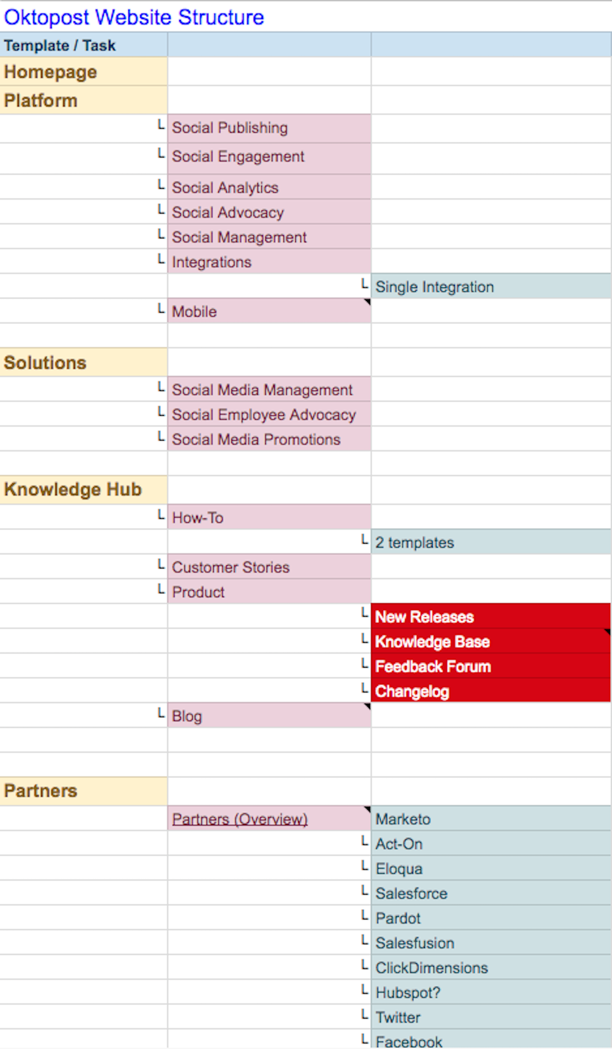
At this stage, you’re not writing out the website copy, you’re simply building a high-level skeleton of your website structure – like this:

This structure will be the building block for what’s next to come in the design process.
Step 5: Solidify Your Brand Voice
Before you even begin crafting your copy, make sure your branding is finalized. A website redesign can be a great opportunity to tweak your brand or do a rebrand altogether.
As a brand, Oktopost is almost unrecognizable to what it was in 2013. So for us, it was mostly about refreshing the website to reflect our personality, core values, and visual identity.

If your company’s culture and values have also changed, so should your brand identity. If the company’s buyers or markets are now different, your brand should reflect this shift. First and foremost, think about your company’s UVP (unique value proposition) as this is the North Star of branding. Once you’ve crystallized what differentiates you from competitors, then you can develop your core values, and subsequently, your brand assets.
For example, a company that values youthfulness should go for vibrant colors and perhaps a quirky tone of voice. In contrast, a company that perceives its personality to be reliable or trustworthy should emphasize customer testimonials as the core of its visuals.
On another note, you should think deeply about emotions and their role in influencing your buyers’ decisions. To harness the power of emotions, we interviewed individual employees from different departments who shed light on how they perceive Oktopost as a brand. The information gleaned from these interviews gave us a much better sense of our company’s personality and core values – and how to convey these on our new website.
Step 6: Establish a Timeline and Budget
Although the website redesign fell under “marketing”, various departments had a role to play in this project. The product team developed the website, sales and customer success informed their contacts in advance, and c-level executives gave approval at each design stage.
Before moving forward with your website redesign, you too should set realistic deadlines and assign tasks accordingly. While a timeline shouldn’t come at the expense of quality, building a framework will ensure that all deadlines are met and the website is launched on time.
If you’re not working with an in-house designer, this is also the time to allocate a budget for managing this project efficiently.
Step 7: Craft Website Copy & CTA’s
By now you should know your target personas inside-out, have a strong grasp of your offerings, and a good sense of your top-performing pages. Next, it’s time to update existing content or write it all from scratch.
The most important thing to consider is your information architecture. If a potential buyer visits your website, how will they experience your messaging, and will this messaging lead to a conversion? If it’s a customer, will the website content prompt them to purchase additional products or services?
The answers to these questions lie in your target personas – what’s in it for them? Print profiles of your buyer personas and lay them in front of you (or your copywriter) as you craft the website content. Every headline, caption, and call-to-action speaks directly to their goals, pain points, and everyday language.
The call-to-actions shouldn’t be static elements, rather an opportunity to actively drive conversions – be it a content download, demonstration, product purchase, etc. So make sure these are extremely engaging and relevant for your buyer personas. We recommend customizing the CTA so it’s unique to each page.

Step 8: Turn Content into Visuals
The content is ready, the hard part is over. Now you can work closely with the designer/design team to visualize everything. As the first step in this process, make sure to clearly convey your needs and goals to the designer. Creating a detailed brief will get both sides on the same page for maximum results.
If you’re collaborating with an agency or a freelance designer, you’ll need to invest more time in walking them through your company, product, and brand. The more informed they are, the better they will be at conceptualizing visuals that tell a story.
While it may not be “PC” to say this – designers can sometimes be blind to content. Admittedly, they care more about the aesthetic appeal and less on the meaning behind the text. This argument may be more true for freelance designers, but regardless, don’t shy away from being hands-on throughout the design process!
As the marketer, you’re the mastermind behind the content, the storyteller behind the text, therefore, working closely with your designer will guarantee that your ideas come to life just like you envisioned.
No Matter What, Test & Iterate
The planning is over, but the testing has just begun!
Once you have parts of your website developed, why not run a couple of A/B tests to understand if your website redesign is effective? You don’t have to be a tech-savvy marketer to do this – there are simple tools out there like Optimizely, which offers simple tools to run small experiments on your website, in real-time.
Start with a few basic tests on your homepage, like changing the color of the CTA button, and seeing which version drives the most conversions.
Another way to collect those insights is by conducting a survey on your website or sending to selected customers whom you trust to give actionable feedback.
There’s no such thing as “perfect”. But listening to your users and optimizing your website to align with their feedback will ensure your new design is performing much better than the old one!
Got some feedback about our new website? We’d love to hear it! Drop us a line at marketing@oktopost.com and let us know how we can improve.


